Arggg! (But yay!) Well my collaborator and I finally figured out why the spectra we were computing were unexpectedly rolling off in the higher wavenumber end. We were calculating spectra of the derivative of our data series, and were using central finite differences to approximate that derivative. We'd figured that central differences were more accurate than forward differences and so we were using those (via Matlab's gradient() function), but we realized - ahem, in hindsight - that there's an important tradeoff to be aware of there. Since the central differences approximate the derivative using the point before and after the present point, it's effectively averaging over three points, and gives you a low-pass filtered version of the derivative. Forward (and backward) first finite differences do this too but over fewer points (two instead of three) so it's not so big an effect. The central diffs caused a big enough effect to be a problem in our work, while the forward diffs do not. Note it depends what aspect of the derivative is most important to you though - phase offset vs frequency rolloff.
In the end we computed the derivative more directly anyway by transforming to the wavenumber domain and multiplying by ik, just to avoid the whole issue. At any rate, I noticed Terry Bahill (retired from Univ Arizona) has a nice brief paper that sums it up well. @#$%, can't believe I didn't notice this earlier...
Tuesday, July 3, 2012
First attempt at using Tableau visualization for estimation results
This is my attempt #1 at using the free Tableau Public visualization software to plot/share results from an example estimation problem, as I explore different approaces to this. The idea is that there's a LOT of information that comes out of these estimation problems, and it's always hard to figure out how to present it all. (It's even worse in my continuous inverse problems, as compared to this relatively-simple two-parameter estimation problem... but one thing at a time!) What intrigues me about Tableau as a possible Tool Of Interest is its purported ability to let a user/viewer (online, say) not merely look at a plot of results, but actually play around with them and explore how they interact. That would be immensely helpful for trying to understand results that are commonly computed in my field.
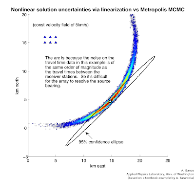
This example problem here is an MCMC (Markov-Chain Monte Carlo) approach to solving Problem 7.1 in Albert Tarantola's Inverse Problem Theory book (amazingly available free online in addition to bookstores), a simple version of finding a seismic source based on arrival times at receiver stations. It's the same problem as is solved by linearization techniques in my Lab#4 (scroll to bottom) for the UW Inverse Theory class that I worked up with Professor Ken Creager. I have a whole webpage coming at some point in near future explaining how this problem example is done with both techniques and providing Matlab/Octave code for it. For now I realize this may be a pile of jargon if you're not yet familiar with the techniques or physics of the problem, as I don't actually describe them here (gotta go read the lab page or the book above!). At any rate, for those at least a little familiar with the problem and/or method, the "map-view" portion of the problem's objective function looks like the following.
 The triangles in upper left corner are receivers that recorded (simulated) earthquake or acoustic transmissions from a source whose location we wish to estimate from the varying arrival times on those receivers. However, since the receivers are so close together compared to the distance to the source, the azimuth angle of the source isn't well resolved even if the radial distance is - you get this arc-shaped uncertainty region reflecting this fact. The MCMC sampling approach can accurately give you this arc (with colors depicting the probability of the source's location along the arc, i.e. white is really low probability); that's unlike the "straight" error ellipse that the linearization technique in our Lab#4 can give - this is the difference between a fully nonlinear vs linear approximation to the solution uncertainties in this problem.
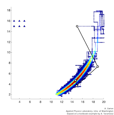
 So that's a great advantage of MCMC, but the only thing is, there's a big catch - this next plot here gives some feel for the number of computational steps that the MCMC approach required (in color) compared to the handful required by the linearization approach in Lab#4 (in black and white). It was something like a million steps compared to five. So there's a very big tradeoff indeed! Notice they start from the same initial-estimate point (I think that's 15,15 or so) and they result in approximately the same highest-probability location for the source (white-circle endpoint on top of reddest region), but the difference in the uncertainties for those two solutions (arc vs ellipse) is the real difference between the two techniques in this problem.
This example problem here is an MCMC (Markov-Chain Monte Carlo) approach to solving Problem 7.1 in Albert Tarantola's Inverse Problem Theory book (amazingly available free online in addition to bookstores), a simple version of finding a seismic source based on arrival times at receiver stations. It's the same problem as is solved by linearization techniques in my Lab#4 (scroll to bottom) for the UW Inverse Theory class that I worked up with Professor Ken Creager. I have a whole webpage coming at some point in near future explaining how this problem example is done with both techniques and providing Matlab/Octave code for it. For now I realize this may be a pile of jargon if you're not yet familiar with the techniques or physics of the problem, as I don't actually describe them here (gotta go read the lab page or the book above!). At any rate, for those at least a little familiar with the problem and/or method, the "map-view" portion of the problem's objective function looks like the following.
 The triangles in upper left corner are receivers that recorded (simulated) earthquake or acoustic transmissions from a source whose location we wish to estimate from the varying arrival times on those receivers. However, since the receivers are so close together compared to the distance to the source, the azimuth angle of the source isn't well resolved even if the radial distance is - you get this arc-shaped uncertainty region reflecting this fact. The MCMC sampling approach can accurately give you this arc (with colors depicting the probability of the source's location along the arc, i.e. white is really low probability); that's unlike the "straight" error ellipse that the linearization technique in our Lab#4 can give - this is the difference between a fully nonlinear vs linear approximation to the solution uncertainties in this problem.
  So that's a great advantage of MCMC, but the only thing is, there's a big catch - this next plot here gives some feel for the number of computational steps that the MCMC approach required (in color) compared to the handful required by the linearization approach in Lab#4 (in black and white). It was something like a million steps compared to five. So there's a very big tradeoff indeed! Notice they start from the same initial-estimate point (I think that's 15,15 or so) and they result in approximately the same highest-probability location for the source (white-circle endpoint on top of reddest region), but the difference in the uncertainties for those two solutions (arc vs ellipse) is the real difference between the two techniques in this problem.
Anyways, so my interest here was playing with how the various aspects of the results could be presented and explored with new tools... so I thought I'd play with Tableau a little bit. The embedded result is at the bottom of this post (expect something dull and limited - this is my first try!). There are a lot of basics I haven't figured out how to do yet here - even super basic stuff like adding on the original receiver locations superimposed onto the north/east geographic plot, or connecting the orange points on that plot with lines so we can see the path of the random walk used in the MCMC computation - so far I think my Matlab plots above are way more informative. But hopefully such basics are easy and doable in Tableau and presumably I simply didn't manage to figure them out in my brief playing around here. My data file that I'm basing it out of is a single six-column ASCII file (or 7 if you include the one for record-number as I couldn't find an automatic field for that yet in Tableau) that was produced by my MCMC computation that was killed halfway through (Tableau Public has a record-limit so that'd be an issue anyway), so you'll note the chopped-off nature of the orange plot below. Columns included sample #, posterior probability, prior probability, acceptance rate, param#1 (north), param#2 (east), and there's a number of useful ways to look at several of these quantities at a time. Again something I particularly like is the idea that the user can interact with the plots. In the embedded plots below, it seems you can double click to zoom in on data regions (haven't figured out how to zoom back out yet!), and get a pop-up box that lists the other data quantities associated with the plotted point (I think there's a way to get all six fields listed there). Among other things I'd like to figure out how to click a point in one plot and show its counterpart in the other plots.
Lastly, a quick troubleshooting note on my use of Tableau Public itself - I ran it in a virtual machine with old Windows XP installed in it (actually tried both VirtualBox and VMware), and on my first tries I could run the whole program until trying to "Save to Web" (their server), when I'd get this error message:
I spent a bit verifying that I had internet connectivity and correct ports open and Tableau Public account correctly set up and so on, to no avail. Turns out that to do the upload to their server, Tableau apparently relies on built-in functionality from the more recent releases of Microsoft Internet Explorer than I had installed - once I ran Windows Update and brought the IEv6 I had up to IEv8, it all worked fine. (Would be nice if the error messages were more informative.)
Alright, well, I look forward to the next iteration of my Tableau attempts for estimation problems like this in the near future. I really like the idea of this tool... even if I haven't yet figured out how to best suit it to my own needs.
Alright, well, I look forward to the next iteration of my Tableau attempts for estimation problems like this in the near future. I really like the idea of this tool... even if I haven't yet figured out how to best suit it to my own needs.
Subscribe to:
Comments (Atom)
